

FEATURED DATA
Biodiversity
Percentages of Species in Threat Categories
This graph shows percentages of species in threat categories of extinction risk. Based on data from 47,677 species, percentages were compiled by the International Union for the Conservation of Nature (IUCN). The IUCN Red List is a comprehensive assessment of the status of Earth’s biological species.
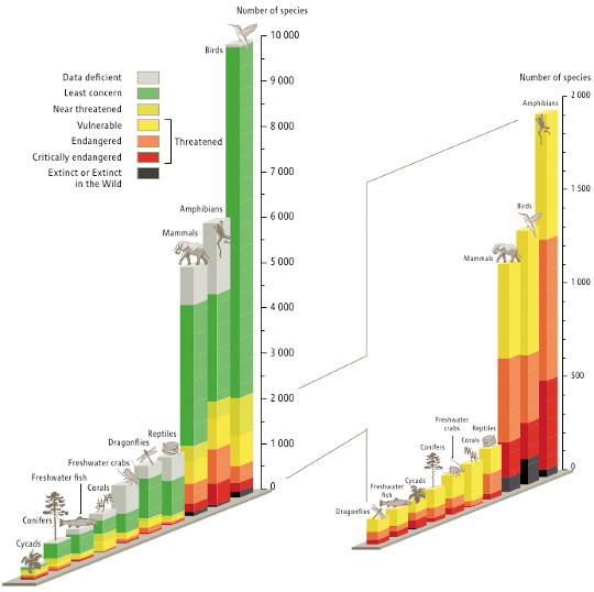
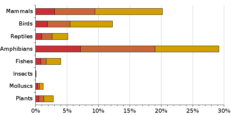
Threat Status of Species by IUCN
These two graphs show the threat status of species as assessed by the International Union for the Conservation of Nature (IUCN). The graph on the right pulls out the data from the “threatened” categories shown in the graph on the left and presents it in more detail.
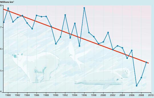
Amount of Floating Sea Ice in the Arctic Ocean
This graph shows the amount of floating sea ice in the Arctic Ocean. What kind of effect would this trend have on the organisms that depend on the ice for habitats and food? What would happen over time to these organisms?
Percentage of Land Driven Toward Plant Species Change
This graph shows the predicted percentages of land on Earth being driven toward plant species changes. It is predicted that by 2100 human-induced global climate changes will change plant communities covering almost half of Earth’s land surface. What kind of changes will occur in the ecosystems in these areas? If the ecosystem changes, what does this mean for the animals (herbivores) that depend on plants for food? What does this mean for the ecosystem’s food chain?
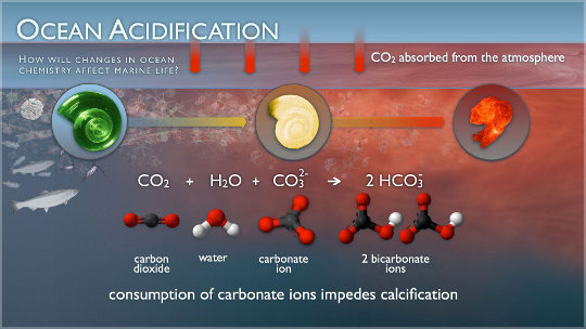
Increasing Ocean Acidification
This image explains the process of ocean acidification, or how Earth’s oceans are becoming more acidic because of increasing carbon dioxide (CO2) in the atmosphere. If calcification (the uptake of calcium into the shells of marine organisms) is reduced because of the increased acidity, how will this affect ocean life? How will these changes affect the marine ecosystems?
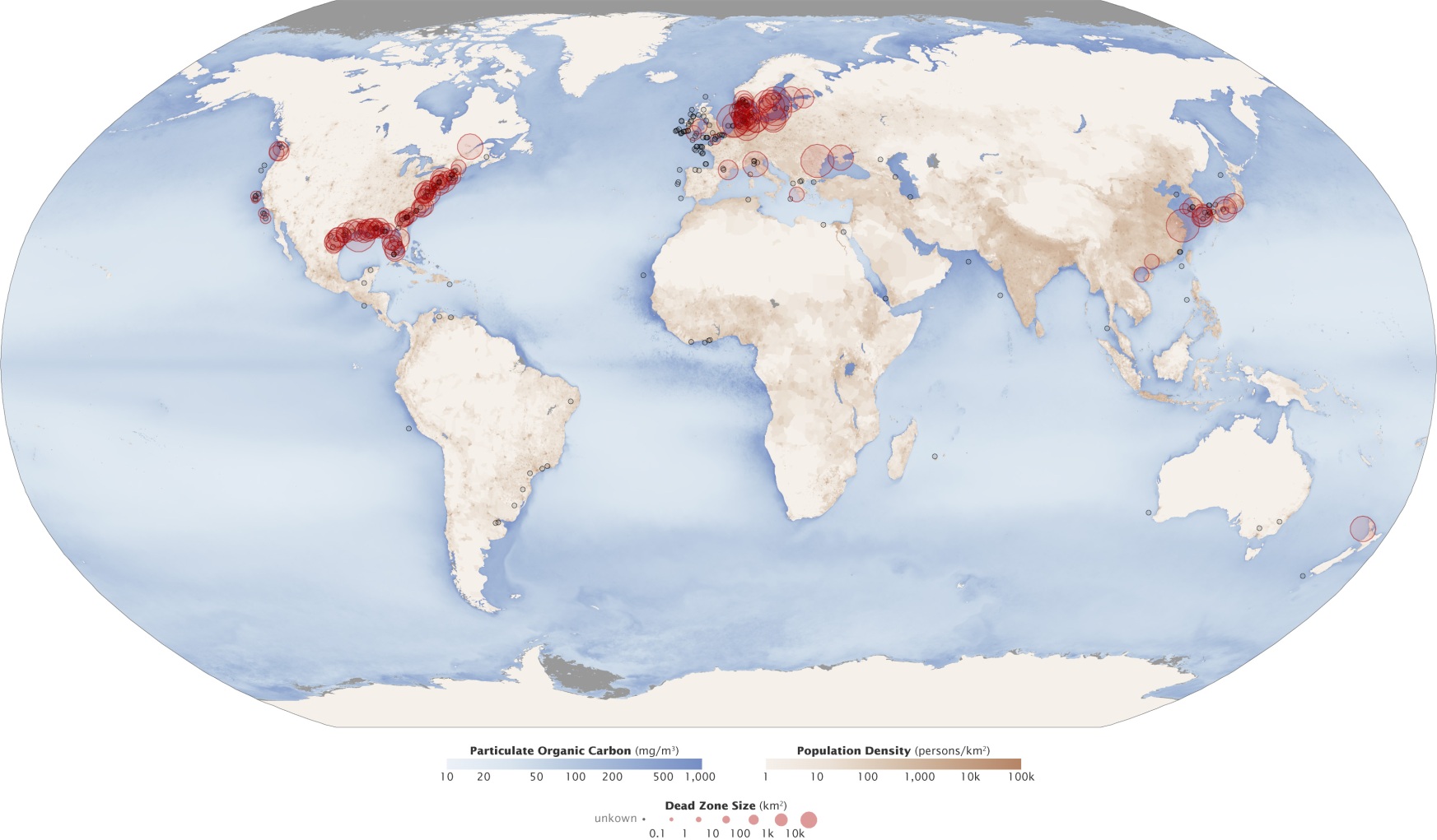
Increasing Oceanic Dead Zones
Earth is experiencing an increasing growth in oceanic dead zones. These are areas that are so low in dissolved oxygen that they cannot support life. Note that the dead zones often occur in coastal areas with high human populations.
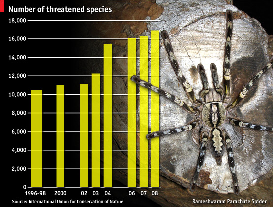
Number of Threatened Species
This bar graph shows the number of threatened species from 1996 through 2008. Why might this number have increased so dramatically in the latter half of the first decade of the 21st century?
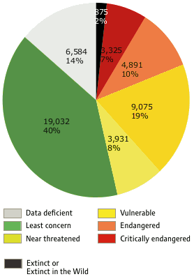
Percentage of Threatened Species on the IUCN Red List
This graph shows percentages of threatened species by category. Percentages were compiled by the International Union for the Conservation of Nature (IUCN). The IUCN Red List is a comprehensive assessment of the status of Earth’s biological species.
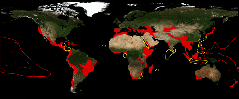
Biodiversity Hotspots
Earth’s biodiversity hotspots are shown on this world map. Red shows terrestrial hotspots; yellow shows marine hotspots.
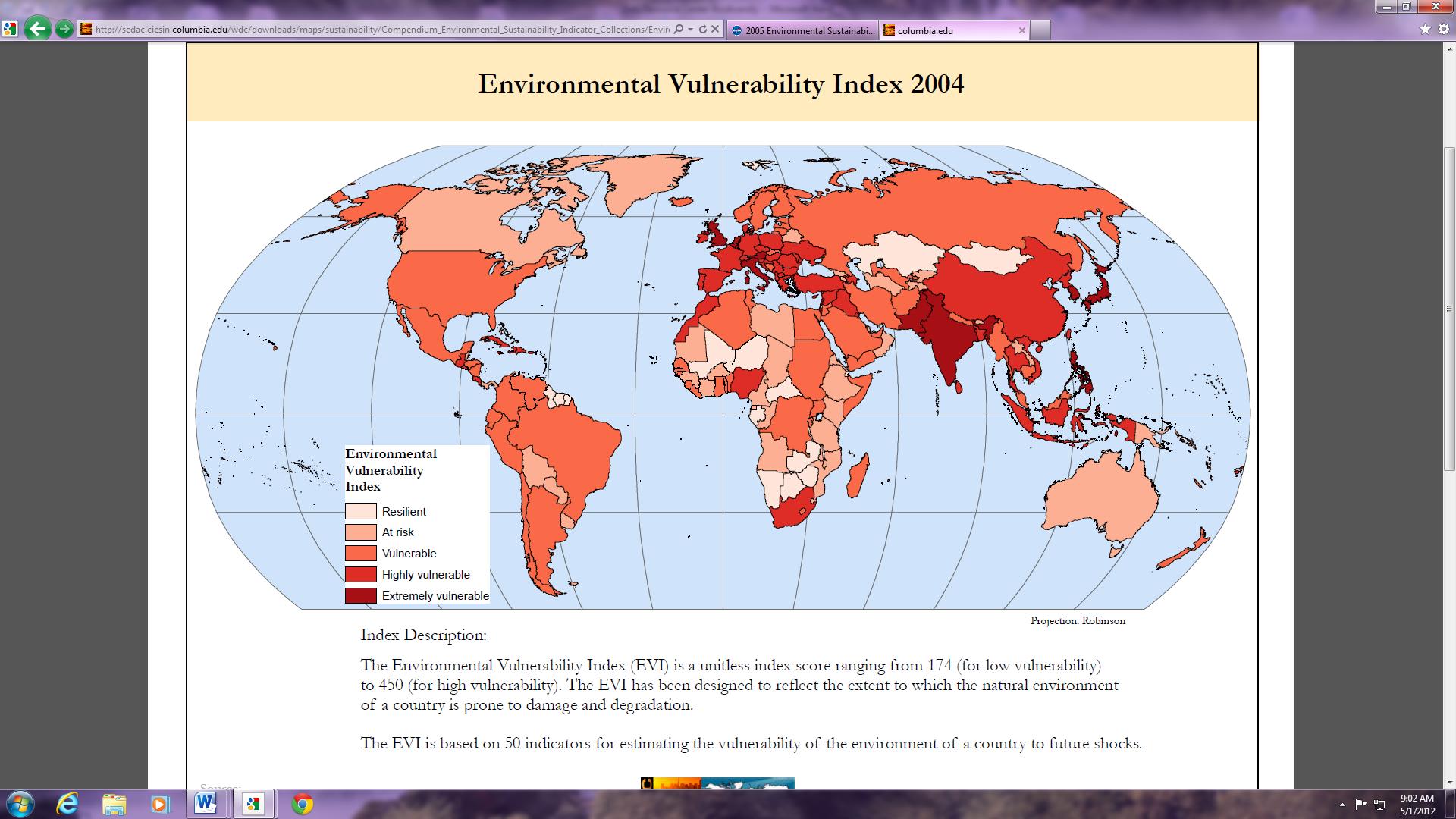
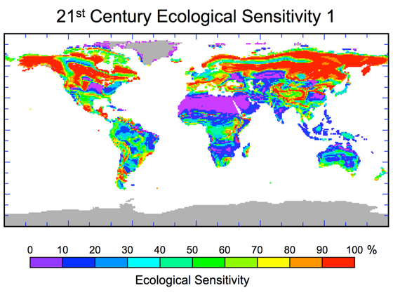
Environmental Vulnerability Index 2004
This worldwide map shows the Environmental Vulnerability Index in 2004. The EVI reflects the degree to which the natural environment is vulnerable to damage and destruction. The EVI is based on 50 indicators that predict the vulnerability of a country to future shocks.
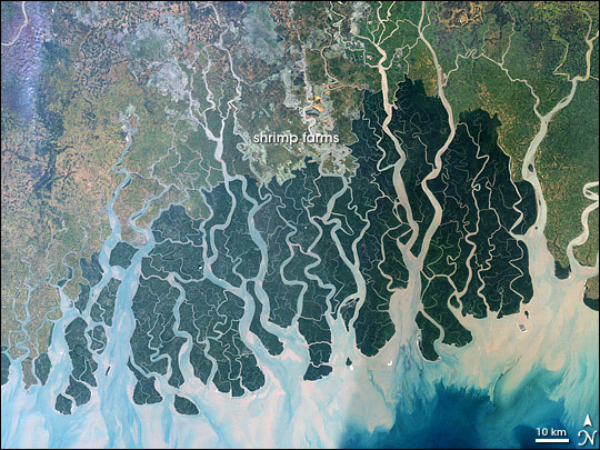
Sundarbans, Bangladesh
Stretching across part of southwestern Bangladesh and southeastern India, the Sundarbans is the largest remaining tract of mangrove forest in the world. The Sundarbans is a tapestry of waterways, mudflats, and forested islands at the edge of the Bay of Bengal. Home to the endangered Bengal tiger, sharks, crocodiles, and freshwater dolphins as well as nearly 200 bird species, this low-lying plain is part of the Mouths of the Ganges. The area has been protected for decades by the two countries as a national ark, despite the large human populations concentrated to the north.
This satellite image shows the forest in the protected area. The Sundarbans appears deep green, surrounded to the north by a landscape of agricultural lands, which appear lighter green. Towns appear tan, and streams are blue. Ponds for shrimp aquaculture, especially in Bangladesh, sit right at the edge of the protected area, a potential problem for the water quality and biodiversity of the area. The forest may also be under stress from environmental disturbance occurring thousands of kilometers away, such as deforestation in the Himalaya Mountains far to the north.
