

FEATURED DATA
Human Health Effects
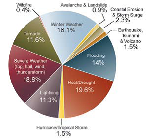
Distribution of Deaths for Hazard Categories
This pie chart shows the percentages of deaths (out of 19,958) blamed on 11 hazard categories from 1970-2004. Heat/Drought caused the most deaths, followed by severe weather. The analysis was performed before the 2005 hurricane season, which resulted in approximately 2,000 deaths.
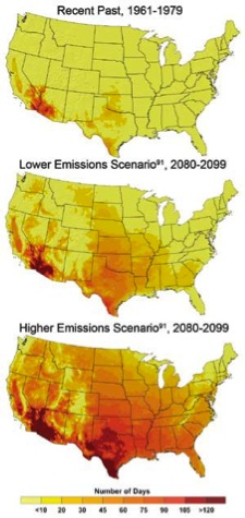
Number of Days over 100 Degrees Fahrenheit
As you can see from the maps, the number of days in which the temperature exceeds 100 degrees Fahrenheit is expected to increase through this century. For example, many parts of the Midwest that have fewer than 10 days with temperatures over 100 degrees Fahrenheit are predicted to have more than 75 days by the turn of the century.
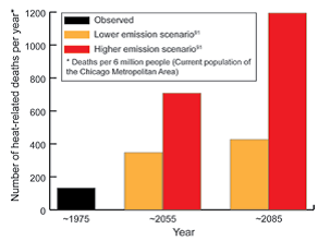
Projected Increase in Heat-related Deaths in Chicago
This graph shows the number of projected deaths per year because of heat stress for the city of Chicago. The projections are averaged over a three-decade period of 1975, 2055, and 2085 under lower and higher CO2 emission predictions.
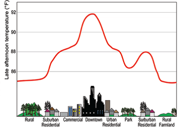
Urban Heat Island Effect
The Urban Heat Island Effect is the increase in temperatures that result when large amounts of concrete and asphalt in cities hold more heat than a rural area would hold. Also, tall city buildings limit airflow, and there is little vegetation to provide cooling shade. Heat-related illnesses increase in cities that can be up to 10 degrees Fahrenheit warmer than already hot temperatures in surrounding areas.
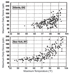
Temperature and Ozone
The graphs show the recorded relationship between ground-level ozone (in parts per billion-ppb) and temperatures in Atlanta and New York City from May to October 1988-1990. As you can see, as the concentration of ozone (an air pollutant) increases, temperatures increase. Ground-level ozone can worsen respiratory diseases.
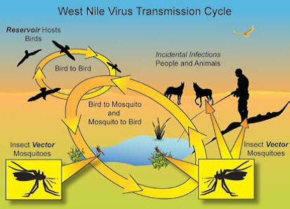
West Nile Virus Transmission Cyle
Recent studies indicate that incidences of West Nile virus disease increase with higher temperatures. Since 1999 there have been more than 28,000 cases of West Nile virus reported cases and more than 1,100 deaths attributed to it in the United States. A more virulent strain that emerged in the United States in 2002 is predicted to increase West Nile virus transmission.
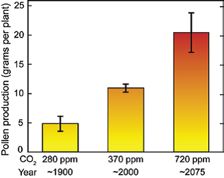
Pollen Counts Rise with Increasing Carbon Dioxide
This graph depicts the pollen counts from ragweed grown in chambers having the CO2 concentration of 280 parts per million (ppm) present in 1900, the pollem count at 370 ppm in 2000, and the projected count in 2075. Allergic reactions to pollen cause respiratory distress to millions of Americans each year.
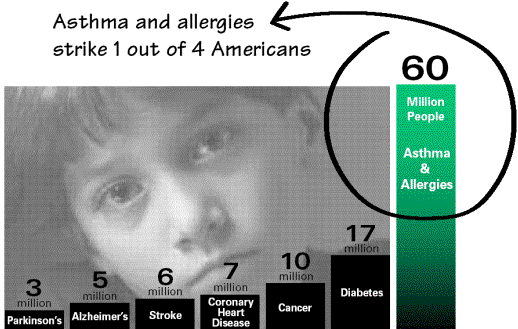
Asthma and Allergies Strike 1 out of 4 Americans
This graphic from the Asthma and Allergy Foundation of America strikingly shows how many Americans are affected by asthma and allergies. Asthma can be a debilitating respiratory disease, and the number of people with asthma in the United States has quadrupled in the past two decades, partly because of climate factors. According to the Centers for Disease Control, asthma accounted for 1.1 million hospital outpatient visits and 1.6 million emergency department visits.
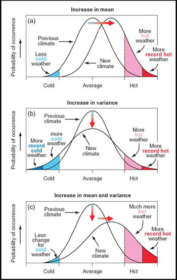
Shifts in the Distribution of Cold and Hot Weather
This graph from the Intergovernmental Panel on Climate Change (IPCC) shows the shift in distribution occurrence of cold and hot weather. It suggests that climate change will result in more heat waves in the United States, which might increase heat-related health risks. IPCC research suggests that if current emissions hold steady, excess heat-related deaths in the United States could climb from an average of 700 per year currently to 3,000-5,000 per year by 2050.

Sediment Plumes in the Hudson River
In the wake of Hurricane Irene and Tropical Storm Lee, sediment choked the Hudson River in New York City in early September 2011. The river’s unusual brown or reddish hue was likely driven by runoff occurring upstate.
The Advanced Land Imager (ALI) on NASA’s Earth Observing-1 (EO-1) satellite captured these natural-color images of the Hudson River and East River. Both images are rotated and north is at right. The top image shows the area on September 12, 2011. The bottom image shows the same place about a year earlier, on Sept. 2, 2010. In September 2010 the water is navy blue. One year later the water is muddy brown, and the brown hue appears more intense in the Hudson River than in the nearby East River.
Flooding not only raises river levels, but it also increases the amount of sediment the rivers carry. Torrential rain eats away at the ground, washing mud and debris into streams. After it is deposited into a river, sediment may sink to the bottom of the riverbed or may flow with the water toward the sea. Multiple rivers feed the Hudson, and some of the sediment winding up in the river in early September 2011 included reddish clays from the Catskills region, The New York Times reported.
