 |
Virtual Ground Truthing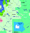 In this section, you have the
opportunity to use part of a Landsat image to see forest conditions in
detail on Mount Rainier and the surrounding countryside. The area you will be examining is shown in the
Rainier area map to the left (click on the map to view a large-scale version). This area
includes only about 1% of the entire northwestern temperate rainforest that extends from
northern California to southern Alaska. However, a detailed examination of the forest and
land use patterns you see in this small area around Mount Rainier will provide you with a
fairly good introduction to the treatment of forests all through the Northwest. In this section, you have the
opportunity to use part of a Landsat image to see forest conditions in
detail on Mount Rainier and the surrounding countryside. The area you will be examining is shown in the
Rainier area map to the left (click on the map to view a large-scale version). This area
includes only about 1% of the entire northwestern temperate rainforest that extends from
northern California to southern Alaska. However, a detailed examination of the forest and
land use patterns you see in this small area around Mount Rainier will provide you with a
fairly good introduction to the treatment of forests all through the Northwest.
Now, how can you ground-truth the satellite image above? It is a bit expensive for most students to travel to Mount Rainier, so you will have to try a different approach: online "virtual ground truthing." In the image, the yellow boxes with numbers in them represent the approximate outlines of areas for which aerial photographs are available. Simply click within a box to see the photograph of that area. Click on the photograph, and an enlargement of the satellite image of the area will appear. If you click on any of the three boxes with letters in them, an enlargement will appear, but no aerial photograph is available for these areas. The original image, the enlargements, and the aerial photographs are all in natural color, so you should be able to recognize the same features in each. Look for specific colors, unusual boundary shapes, and prominent features such as mountains or lakes to help you orient yourself in the different images. Now comes the challenge! Your objective is to use the aerial photographs to virtually ground truth the satellite image and then to make a land-use map of the entire image. To begin, download any or all of the following TIFF image files: R321, R752, or R752s, and save them on your hard drive. R321 is a true-color image similar to the one above but without the yellow boxes. The other two are false-color images, stretched to emphasize different details in the scene. All three images were derived from Thematic Mapper scene #Y5308418181X0, obtained from the EROS Data Center DAAC. Look at the three versions of the image and choose one of the three as the "base" for your map. Print a copy of that image. (Features are easier to see on a color print than on a black-and-white print, so use color if you have access to a color printer.) Use the aerial photographs, the enlargements, the three different versions of the satellite image, and the Rainier area map to identify the main colors and features in the satellite image. Use the Forward and Back buttons on your browser to cycle between the satellite image, the aerial photograph, and the enlargements. If cycling the images is too slow using your browser, download the images and compare them using a viewer application on your hard drive. Make a list of identifying characteristics of each type of color and feature, and note typical examples of each type on your hard-copy print. For example, you might determine that a particular shade of green represents old-growth forest, and that another shade of green represents grassy fields. You should be able to identify water, snow/ice, bare rock/soil, urban/suburban areas, grassy fields, clear-cut areas, regrowing forests, and old-growth forests. You should also be able to recognize features such as mountains, roads, and rivers. Note that the difference between regrowing and old-growth forests is not apparent in R321 but is quite obvious in R752. Once you have identified the important colors and features in the satellite image, use the following procedure to make your land-use map of the entire image. At the very least, you should show areas containing old-growth forest, regrowing forest, logged areas, water, and "other." You may also want to subdivide "other" into farming and urban areas, etc., and to include a few prominent features such as the glaciers on Mount Rainier. Using NIH Image, Open the image you chose for your base. Select the pencil icon from the Tools bar. This tool draws a freehand line one pixel wide. Now select a color for the pencil line that has two properties: a color that does not already appear in the image and that will show up clearly. To select a color, scroll the cursor onto the LUT while the pencil is selected. The cursor will change into an icon resembling an eye dropper. The Info box will show the Index (DN value) the cursor is currently at in the LUT and the RGB values of the color. To select a color, simply click on the LUT. The color you select will appear in the paint brush icon on the Tools bar. To find out which colors do not occur in the image, select Analyze/Show Histogram. When the histogram window appears, watch the Info box while you scroll the cursor across the histogram window. The Level tells you the DN value, and the Count tells you how many pixels in the image have that particular DN value. Look for Levels that show Counts: 0. These colors are not present in the image. Select a bright one such as Index = 5, or 35, or 215. Now carefully outline the old-growth and logged areas in the image, as well as any other types of areas you want to show. The pencil tool will continue to draw as long as you hold the mouse button down. If you make a mistake, select Edit/Undo, and the last line you drew will disappear. Save the image from time to time to avoid losing your work if your computer should freeze up. Making a high-quality, detailed map will take time and patience. When you are finished, select Options/Density Slice, use the LUT tool to contract the red-colored bar that appears in the LUT to a single Index value, and scroll the red bar to the pencil color you selected. Your lines in the image should be highlighted in red. Now select black for the pencil tool and white for the eraser tool. Select Process/Apply LUT, select both "Replace" options in the dialog box that appears, and click OK. Everything in the image will disappear except your lines (which will turn black). Save the new image under a different name. Use the eraser or the pencil tool colored white to remove mistakes or any stray spots left by the conversion process. Select Process/Binary/Skeletonize to "slim down" your lines. Once you have finished cleaning up your outline map, resave it. Now comes the fun part. Choose a set of colors to represent the different land-use types you outlined. Select the Bucket icon in the Tools bar, and select your colors from the LUT. Use the bucket to fill each small area with the appropriate color. If there are any breaks in your lines, the colors will "leak out." When you are finished, label the map and make a legend identifying the meaning of each color. Now when you compare your map with the original satellite image, you will clearly be able to see how much of the forest has been cut down and where the stands of old-growth trees remain. [ Viewing Forests from Space ] [ Virtual Ground Truthing ] [ Home ] [ Teacher Pages ] [ Modules & Activities ] |
![]()
HTML code by Chris Kreger
Maintained by ETE Team
Last updated November 10, 2004
Some images © 2004 www.clipart.com
Privacy Statement and Copyright © 1997-2004 by Wheeling Jesuit University/NASA-supported Classroom of the Future. All rights reserved.
Center for Educational Technologies, Circuit Board/Apple graphic logo, and COTF Classroom of the Future logo are registered trademarks of Wheeling Jesuit University.
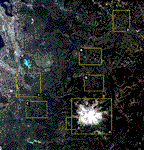 A true-color Landsat
image of Rainier area is presented to the right (click on the image to view a large scale
version). The colors approximate what you would see if you were flying over the area in
full sunlight on a cloudless day. One of the challenges of using this and other satellite
images is to figure out what you are really looking at. The perspective of satellite
images--looking down on the tops of things--is unfamiliar to many people, making
identification of features difficult. Also, satellite images are often colored in unusual
ways, contributing to the difficulty of identification. The best way to find out what
different shapes and colors in a satellite image really are is to do "ground
truthing." In ground truthing, you actually visit a site on foot, in a car, in a
boat, or in a low-flying airplane to inspect a particular feature or color seen in a
satellite image. Ground truthing could determine that a straight, dark feature is a road;
a crooked line is a stream; a patch of light green is a wheat field; a patch of dark green
is a section of old-growth forest, and so forth. Once the identity of typical features and
colors on some parts of a satellite image has been verified by ground truthing, it can be
reasonably assumed that similar features and colors in other parts of the image can be
properly identified without actually visiting them on the ground.
A true-color Landsat
image of Rainier area is presented to the right (click on the image to view a large scale
version). The colors approximate what you would see if you were flying over the area in
full sunlight on a cloudless day. One of the challenges of using this and other satellite
images is to figure out what you are really looking at. The perspective of satellite
images--looking down on the tops of things--is unfamiliar to many people, making
identification of features difficult. Also, satellite images are often colored in unusual
ways, contributing to the difficulty of identification. The best way to find out what
different shapes and colors in a satellite image really are is to do "ground
truthing." In ground truthing, you actually visit a site on foot, in a car, in a
boat, or in a low-flying airplane to inspect a particular feature or color seen in a
satellite image. Ground truthing could determine that a straight, dark feature is a road;
a crooked line is a stream; a patch of light green is a wheat field; a patch of dark green
is a section of old-growth forest, and so forth. Once the identity of typical features and
colors on some parts of a satellite image has been verified by ground truthing, it can be
reasonably assumed that similar features and colors in other parts of the image can be
properly identified without actually visiting them on the ground.